Life-cycle of a Data Science Project

Cover

Are you wondering how would the life-cycle of a data science project be? Here you go..
Problem Identification:

1 identify-the-problem

Have you ever heard the phrase “Here’s the data, can you do some analysis find some insights?” Often, management approach Data Scientists with vague or even undefined goals. Understanding the goal is important and sets up the rest of the project for success.

This step consumes up about 10% of the time in the project life-cycle

Data Preparation:

2 data prep

So far, everybody’s least favorite stage, but possibly the most important one. Data can come from different sources, be in the ugly format, and have errors and a myriad of other problems. A single error in this stage can render the rest of the analysis useless.

That’s why typically, up to 70% of the time is spent here.

Analyse the data:

3 Data-Analysis

Creating models, performing data mining, setting up simulations etc. This is the most exciting part and if the previous stages were done correctly, analyzing the data and getting insights will feel like a good.

Time needed here would be 10%

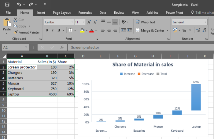
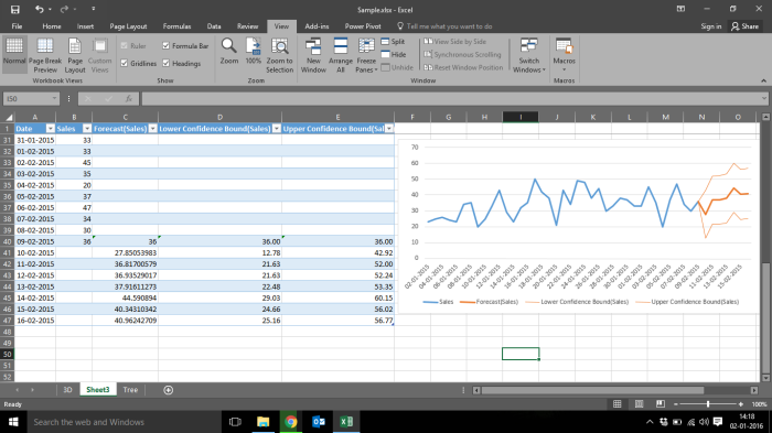
Visualization of the insights:

4 Visual

Visualizing comes hand-in-hand with analyzing. This is a powerful technique as looking at the data in various forms and shapes can help reveal insights that are otherwise not evident. Also several projects such as BI dashboards don’t need much analysis but rely on visualization instead.

Time needed here would be 10%

Presentation of the findings:

5 data-presentation

We’ve reached 100% the project is over! Actually, No. Presenting findings is a whole separate “Additional” stage. You need to not only convey the insights in your audience’s language but also get buy-in from them to take action based on those insights. This is an art.

Time needed: extra 80% 🙂

Hope you benefited ! Enjoy learning!

Data Engineer vs Data Scientist (Infographic)

This Infographic will assist us to understand better about the skills and responsibilities of Data Engineer and Data Scientist. Also, it helps us to compare salaries, popular software and tools used by each. Hope this helps!

data-engineer-vs-data-scientist

Top 8 Viz features in Excel 2016 !

This is especially for the excel lovers! In this blog, we will see few of the new and exciting data visualization features of Excel 2016.

Here is the list of new features

  1. Hierarchy Chart/Tree Map
  2. Sunburst
  3. Water fall or Stock Chart
  4. Transform Cold data into a cool picture
  5. Instant Histogram
  6. Pareto Chart
  7. 3D map
  8. One click forecast

These are the most wanted charts by the Dashboard creators. These are very simple and attractive. This set of features makes excel more competitive with other expensive visualization tools.

  1. Hierarchy Chart/Tree Map:

Select the data that you want to use for creation of the chart then Go to ‘Insert’ tab > Charts > Insert Hierarchy Chart

Hier

Isn’t it cool? OK, we go to the next one.

2. Sunburst/Donut Chart:

It is another representation of a Pie chart. An alternate to boring the Pie chart. Go to ‘Insert’ > Charts > Insert Hierarchy ChartSunburst

3. Water fall or Stock Chart

It is recommended to sort the data by any order to have the better insights.Screenshot 2016-01-02 12.13.11.png

4. Transform Cold data into a cool picture

This one is based on the Add-ins.

Screenshot 2016-01-02 13.10.54

Select your data to visualizeScreenshot 2016-01-02 12.21.56Screenshot 2016-01-02 12.22.02

Select ‘Settings’ to change the design of the chartsScreenshot 2016-01-02 12.24.11

5. Instant Histogram:

Create histograms quickly instead of going to “Analysis Tool Pack” in add-ins. Go to Insert > Charts > Histogram

Screenshot 2016-01-02 13.38.51.png

6. Pareto Chart:

Earlier, we had to customize the data structure to create ‘Pareto chart’ but now it is just a click away to explain the 80/20 principle.

Screenshot 2016-01-02 13.50.36.png

7. 3D map:

Power Map, the popular 3-D geospatial visualization add-in for Excel 2013, is now fully integrated into Excel. We’ve also this feature a more descriptive name, “3D Maps”. You’ll find this functionality alongside other visualization features on the Insert tab.

Screenshot 2016-01-02 13.55.08

It will open another sheet like below Screenshot 2016-01-02 14.00.36.png

then we can change the theme and other options like ‘2D Map’. “Play Tour” option will show an awesome chart with lively visual.

Screenshot 2016-01-02 14.02.13Screenshot 2016-01-02 14.03.48

8. One click Forecast

It has become more easy for the Data analysts who do forecast.

Select the data that you want to forecast and Go to ‘Data’ tab > Click on “Forecast Sheet”

Screenshot 2016-01-02 14.11.35

Adjust the “Seasonality” appropriatelyScreenshot 2016-01-02 14.17.37

Screenshot 2016-01-02 14.18.19

and your forecast is ready.

Hope you like these features and much more to come from Microsoft. Try these things and enjoy !

Data Viz ! Cheat sheet for R Data Analyst

Data visualization has become a vital slice of data science arena. Hence, our key tool should have strong capabilities on both the fronts – data analysis as well as data visualization. With this revolution in the landscape, or has extended immense popularity because of its splendid data visualization capabilities. With a few lines of code, you can produce beautiful charts and data stories. R contains superb libraries to create basic and more evolved visualizations like Bar Chart, Histogram, Scatter Plot, Map visualization, Mosaic Plot and various others. Below is the cheat sheet of widespread visualization for representing data. Thanks to my colleague for sharing this.

Data Viz Cheat Sheet